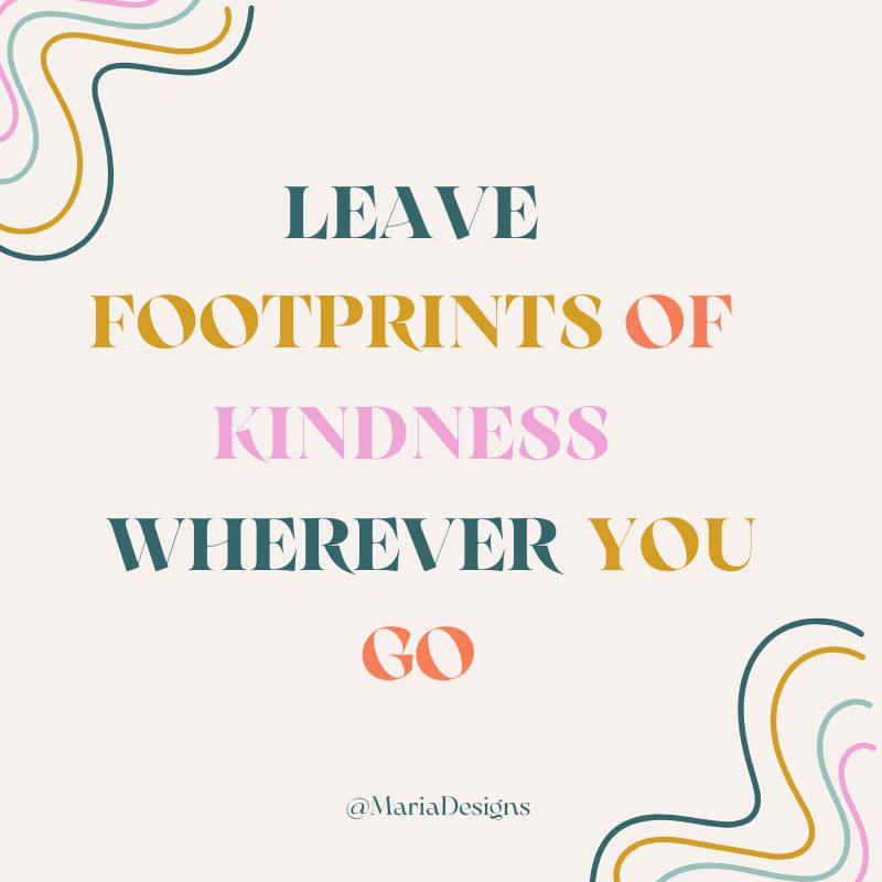
The Core Conversation: Who Are You, Really?
Every great identity needs a strong anchor. Before we even think about visuals, we start with the core conversation. This means getting to the heart of your business: understanding your values, defining your mission, and mapping out what specific problem you solve for your customers. If we know who you are and who your ideal clients are, the design process becomes clear.
My Mission & Vision
I launched Maria Designs because I saw a need in my community. I take the strategic skills I honed in the corporate world and apply them directly to local, passionate small businesses. My goal is simple: to make beautiful, effective branding and marketing accessible to driven entrepreneurs—especially women and BIPOC business owners—so they can stand out and thrive locally.
Design Research: Getting to Know Your Neighbors
Before a single color is chosen or a font is selected, I roll up my sleeves and dive into the market. This phase is about doing the homework: I check out how your competitors are showing up, study the packaging designs that genuinely stand out, and track the current visual trends. While I gather inspiration from everywhere, every creative decision I make is firmly rooted in your core brand strategy. This ensures the final design is not only beautiful but also truly authentic and relevant to the people you want to reach.
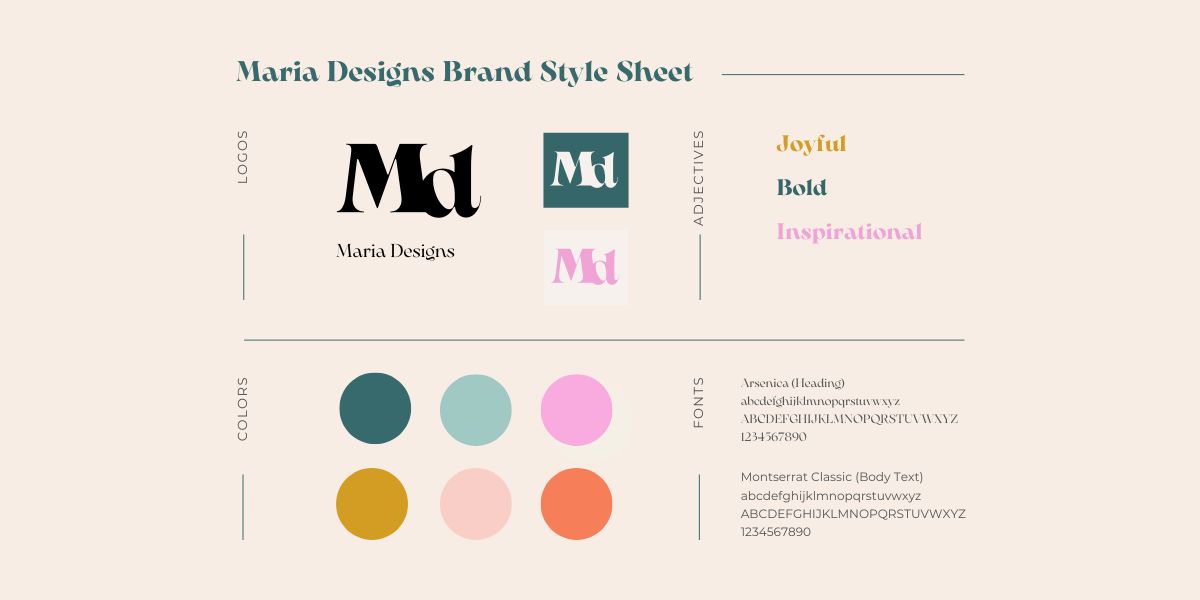
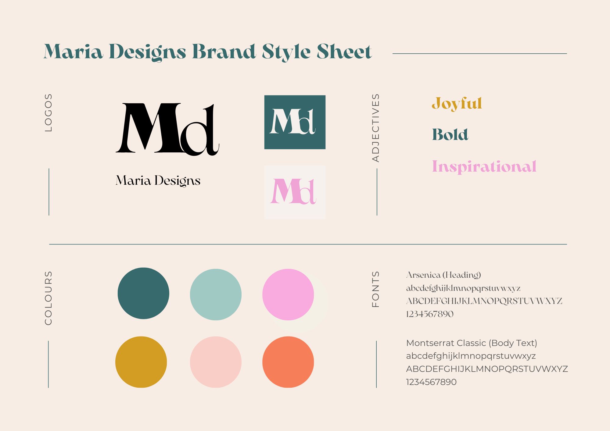
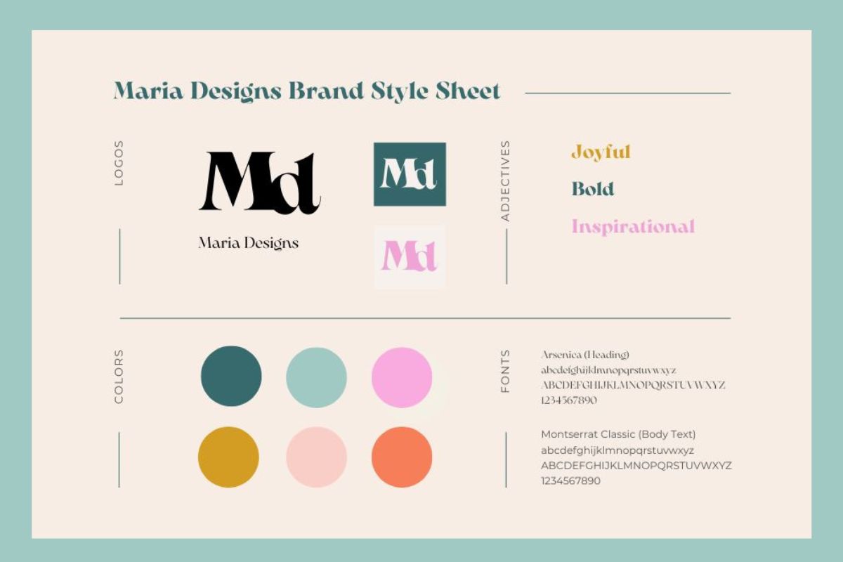
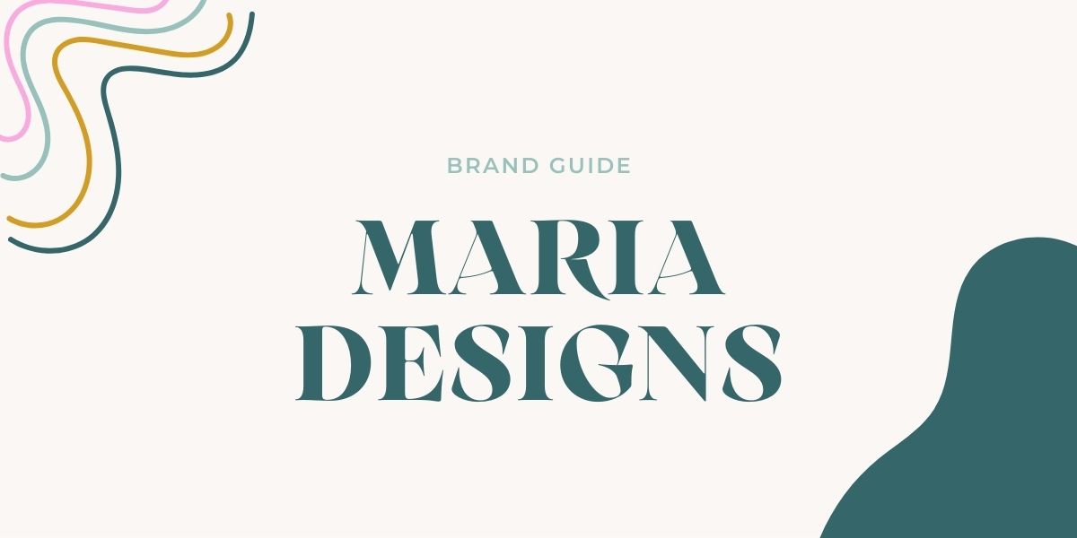
Maria Designs Brand Style Sheet
The Toolkit: Creating Your Visual Guidebook
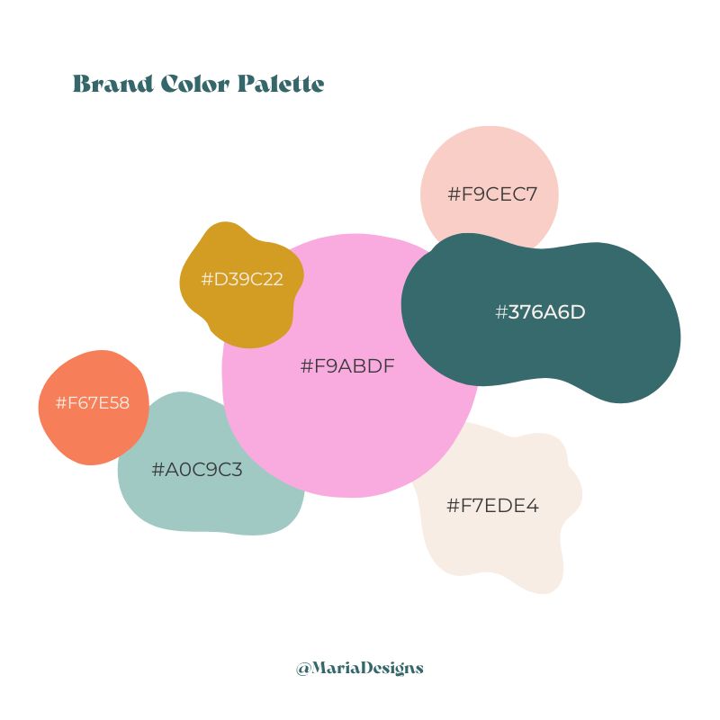
After the research phase is complete, it's time to translate those core concepts into a solid visual system. I put together a Brand Style Guide—think of it as your brand's official handbook. This guide brings all your elements together: your final logo and its variations, the specific color palette (and the feeling each color conveys), the approved typography, and the defining adjectives that capture your brand's personality. This step ensures that your brand speaks with one consistent voice, everywhere.
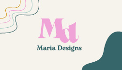
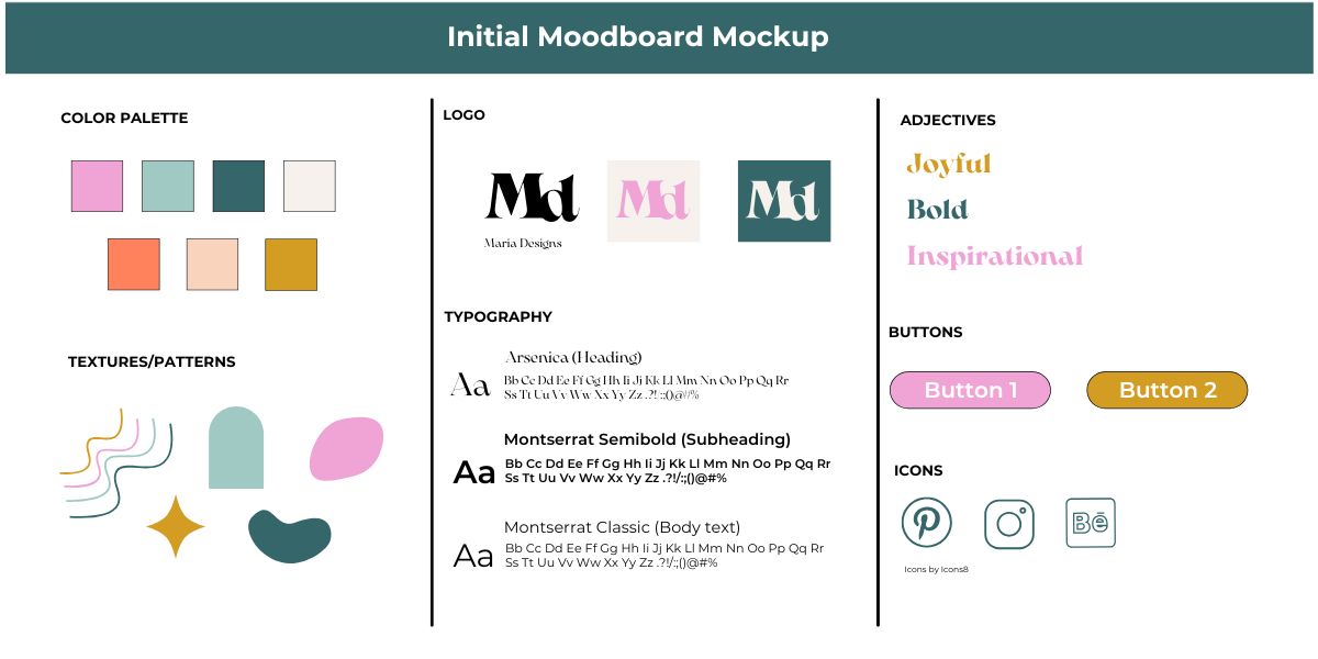
Logo Mockups
The Main Mark: Your Signature on the World
When designing the central logo, I focus on two key things: approachability and staying power. I created the primary logo using professional tools like Adobe InDesign to ensure it's not just trendy, but timeless and easy to recognize, no matter how small it appears (on a business card, or a favicon). I deliver a complete system, including primary color versions, the reversed option (for dark backgrounds), and the classic black-and-white version—guaranteeing that your signature looks perfect wherever you need to place it.
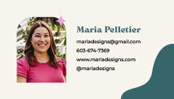
Design Application and Collateral
Putting It to Work: Showing Up Consistently
The grand finale is launching your brand into the real world! This is where I apply the new identity across all the materials you need to run your business. From the foundational assets like business cards to your digital storefront like your website and your presence on social media, I make sure every single customer touchpoint is cohesive, consistent, and undeniably you.
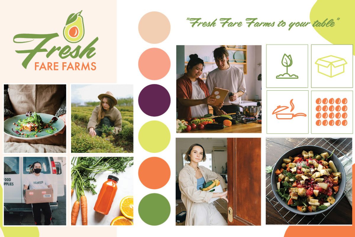
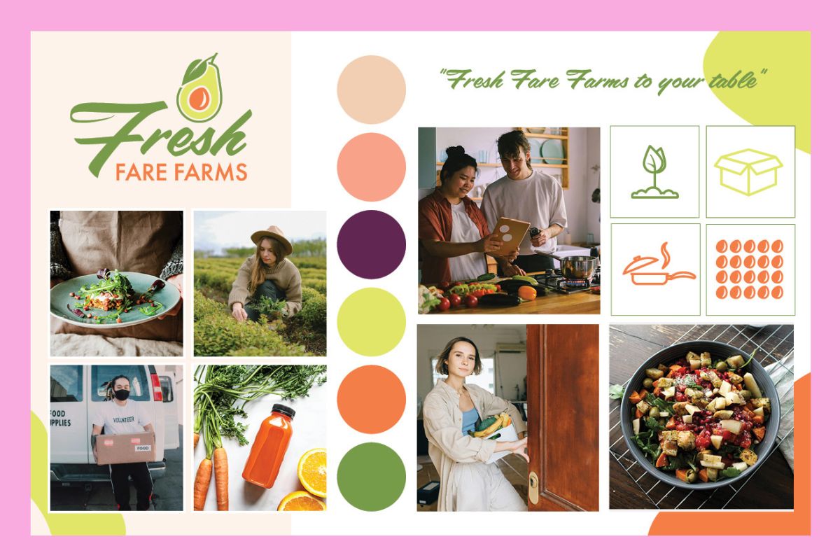
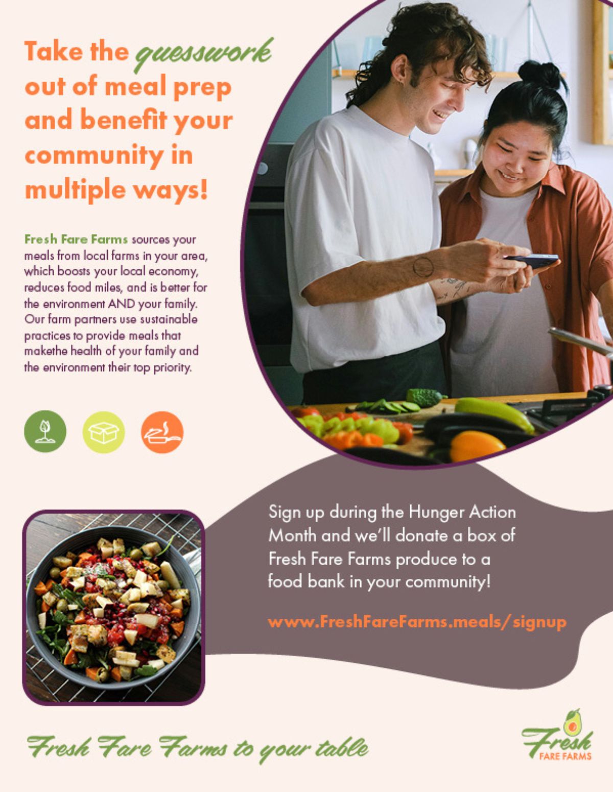
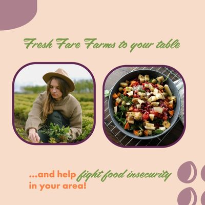
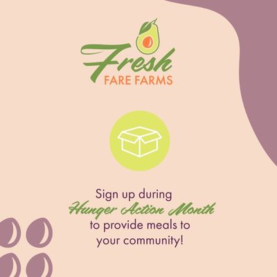
Fresh Fare Farms
Project Overview
I was brought on board by Fresh Fare Farms to develop a multi-channel advertising campaign that could be easily adapted across various marketing platforms. The core objective was to launch their meal kit service while highlighting their commitment to sustainability and community support.
- Expand the Customer Base: Reach a younger demographic of busy professionals.
- Educate on Value: Inform consumers about the benefits of locally sourced food and sustainable farming practices.
- Drive Community Action: Highlight their partnership with Hunger Action Month, where sign-ups lead to direct donations to local food banks, providing an easy way for customers to help their community.